The sticky post should be distinctly recognizable in some way in comparison to normal posts. You can style the .sticky class if you are using the post_class() function to generate your post classes, which is a best practice.
They should show at the very top of the blog index page, even though they could be several posts back chronologically.
They should still show up again in their chronologically correct postion in time, but without the sticky indicator.
If you have a plugin or widget that lists popular posts or comments, make sure that this sticky post is not always at the top of those lists unless it really is popular.
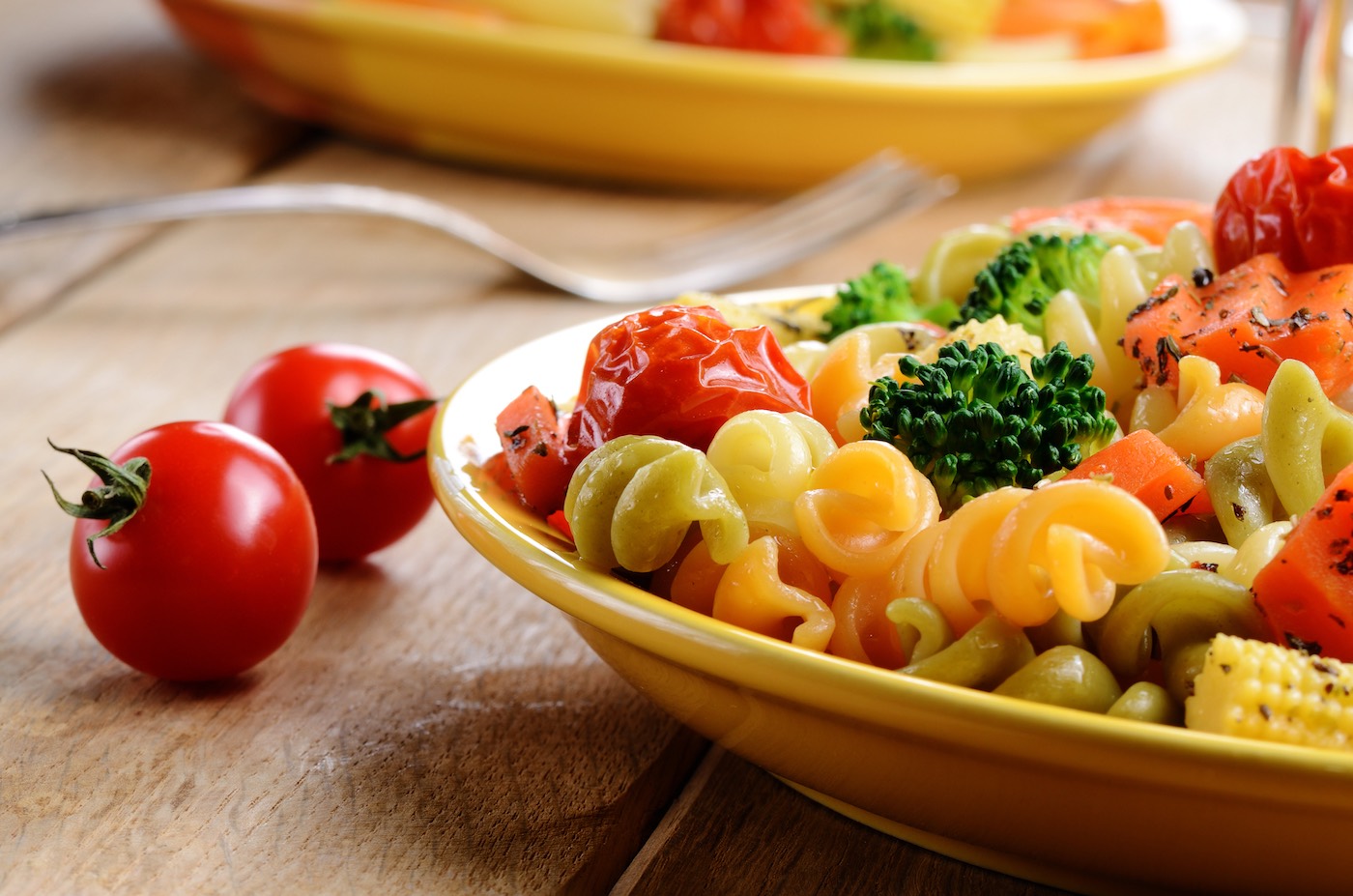
Smart Snacking: How to Choose the Best Healthy Treats for Your Lifestyle
In a world filled with sugary temptations and highly processed snacks, finding a healthy alternative can feel overwhelming. But smart snacking doesn’t mean sacrificing flavor or satisfaction—it’s all about making informed choices that align with your lifestyle and wellness goals. Whether you’re looking for an energy boost, a way to curb cravings, or a nutritious treat for your family, here’s how to choose the best healthy snacks while enjoying every bite.
Look for Wholesome Ingredients
The foundation of a nutritious snack is its ingredients. Skip snacks loaded with artificial flavors, preservatives, and refined sugars, and instead, look for whole foods like:
Nuts and seeds – Packed with healthy fats and protein.
Whole grains – Provides fiber for sustained energy.
Natural sweeteners – Such as honey, maple syrup, or fruit, instead of refined sugars.
Our healthy baked goods are made with real ingredients that nourish your body while delivering incredible taste.
Consider Your Dietary Goals
Everyone has unique nutritional needs, and the best snack for you depends on your personal goals. If you’re looking for an energy boost, snacks with a balance of protein, fiber, and healthy fats can keep you going. For weight management, nutrient-dense options help curb cravings without empty calories. Those focused on muscle recovery benefit from snacks rich in protein and complex carbohydrates.
Whether you need a post-workout bite or an afternoon pick-me-up, our snacks offer a delicious way to stay on track.
Choose Snacks That Keep You Satisfied
A great snack should satisfy both your taste buds and your hunger. The key is finding options that offer a balance of macronutrients—protein, fats, and carbs work together to keep you full. Texture also plays a big role in satisfaction, whether you prefer something crunchy, chewy, or soft.
From crunchy dehydrated treats to soft, wholesome baked goods, our snacks are designed to hit the spot without the guilt.
Convenience Matters
Busy schedules often lead to unhealthy snacking choices. Having healthy, ready-to-eat options makes it easier to stay on track. The best snacks are easy to grab and go, have a decent shelf life without added preservatives, and require minimal preparation.
That’s why we craft snacks that are both delicious and convenient—so you never have to compromise on health when life gets busy.
Enjoy What You Eat!
Healthy snacking shouldn’t feel like a chore. The best snack is one you actually enjoy eating! By choosing nutritious yet flavorful treats, you can develop long-term habits that support your well-being while still indulging in delicious flavors.
At our shop, we believe in snacks that make you feel good inside and out. With every bite, you’re choosing health, flavor, and a smarter way to snack.
There’s something undeniably comforting about the aroma of freshly baked treats wafting through the kitchen. From warm, gooey cookies to golden loaves of bread, homemade baked goods have a way of bringing people together and evoking feelings of joy and contentment. But beyond their delicious taste and heartwarming appeal, homemade baked goods offer a myriad of benefits that make them a wholesome choice for both body and soul.
Made with Love
One of the most beautiful aspects of homemade baked goods is the love and care that goes into making them. Unlike store-bought treats mass-produced in factories, homemade baked goods are crafted with hands that pour love and attention into every step of the process. Whether it’s kneading dough, mixing batter, or decorating cookies, the act of baking becomes a labor of love, imbuing each treat with a special touch that can’t be replicated.
Quality Ingredients
When you bake at home, you have full control over the ingredients you use. This means you can select high-quality, wholesome ingredients free from artificial additives, preservatives, and excessive sugar or salt. By choosing whole grains, fresh fruits, and natural sweeteners, you can create baked goods that not only taste delicious but also nourish your body and mind.
Customizable and Adaptable
One of the greatest joys of homemade baking is the freedom to customize recipes to suit your tastes and dietary preferences. Whether you’re vegan, gluten-free, or simply looking to reduce your sugar intake, there are countless substitutions and variations available to accommodate your needs. From swapping out butter for coconut oil to using flaxseed meal as an egg replacer, the possibilities are endless, allowing you to create baked goods that are as unique as you are.
Family Bonding and Tradition
Baking has a way of bringing families together and fostering cherished memories that last a lifetime. Whether it’s baking cookies with grandma, decorating cupcakes with the kids, or sharing recipes passed down through generations, the kitchen becomes a place of connection and tradition. Baking together not only strengthens familial bonds but also provides valuable opportunities for learning, creativity, and self-expression.
Mindful Indulgence
In today’s fast-paced world, taking the time to bake from scratch can be a form of self-care and mindfulness. The rhythmic process of measuring, mixing, and baking can be a soothing escape from the stresses of daily life, allowing you to focus on the present moment and find joy in the simple act of creating something delicious. And when you finally sit down to savor your homemade treats, you can do so with a sense of satisfaction and gratitude, knowing that you’ve nourished both body and soul.
Sharing the Love
One of the greatest joys of homemade baking is sharing your creations with others. Whether you bake a batch of cookies for a friend in need, whip up a cake for a birthday celebration, or host a holiday cookie swap, homemade treats have a way of spreading joy and kindness wherever they go. By sharing your love of baking with others, you not only create lasting memories but also strengthen the bonds of friendship and community.
In conclusion, homemade baked goods are more than just tasty treats—they’re expressions of love, creativity, and tradition. By baking from scratch, you not only nourish your body with wholesome ingredients but also nourish your soul with the joy of creation and connection. So why not dust off your apron, preheat your oven, and embark on a delicious baking adventure today? Your taste buds—and your heart—will thank you for it.
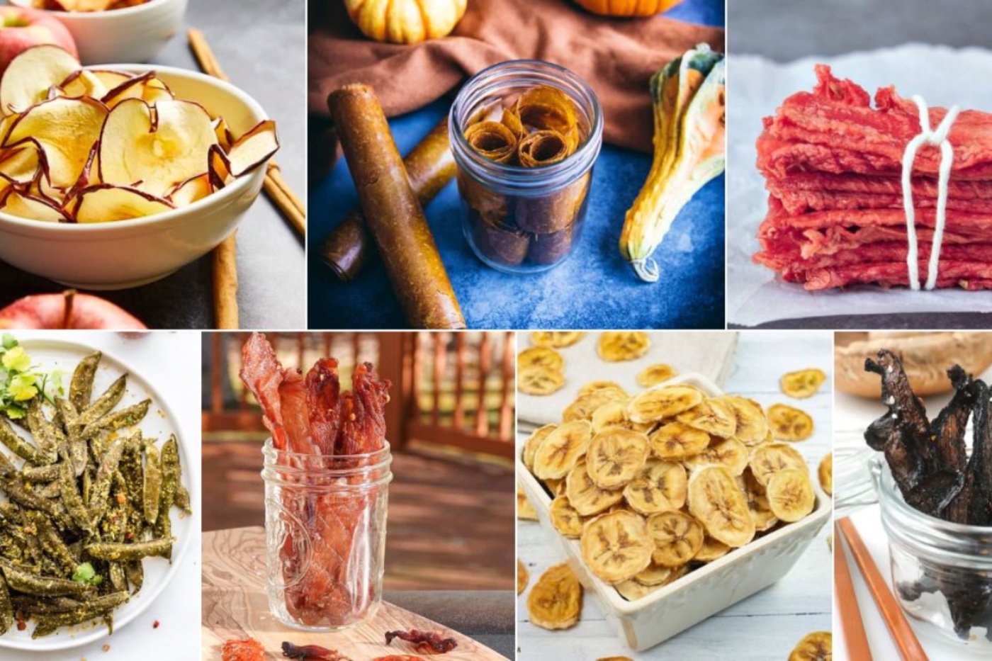
In a world where convenience often trumps health concerns, finding snacks that are both nutritious and easy to grab on the go can feel like an uphill battle. However, there’s one option that stands out among the crowd: dehydrated foods.
Dehydrated foods have been around for centuries, utilized as a means of preserving fruits, vegetables, and meats without the need for refrigeration. But beyond their longevity on the shelf, dehydrated foods offer a myriad of benefits that make them an ideal choice for snacking.
Nutritional Powerhouses
Contrary to popular belief, the dehydration process does not significantly diminish the nutritional value of foods. In fact, dehydrated fruits and vegetables retain most of their vitamins, minerals, and antioxidants, making them a nutrient-dense option for snack time. For example, dehydrated fruits like apples and bananas are packed with fiber, potassium, and vitamins C and B6, while dehydrated vegetables such as carrots and kale offer an abundance of beta-carotene and other essential nutrients.
Concentrated Flavor
One of the most appealing aspects of dehydrated foods is their intense flavor. The removal of water concentrates the natural sugars and flavors of fruits and vegetables, resulting in a taste sensation that’s both satisfying and delicious. Whether you’re craving something sweet or savory, dehydrated foods offer a burst of flavor in every bite, making them a tantalizing alternative to processed snacks laden with artificial ingredients.
Crunchy Texture
There’s something undeniably satisfying about the crisp, crunchy texture of dehydrated foods. Unlike their fresh counterparts, which can sometimes be soft or mushy, dehydrated fruits and vegetables retain a satisfying crunch that adds an extra dimension to snacking. From crispy apple chips to crunchy kale crisps, dehydrated foods provide a satisfying mouthfeel that keeps you coming back for more.
Portability and Shelf Stability
One of the biggest advantages of dehydrated foods is their portability and shelf stability. Unlike fresh produce, which can spoil quickly if not consumed in a timely manner, dehydrated foods can last for months or even years when stored properly. This makes them perfect for stashing in your desk drawer, gym bag, or backpack for a nutritious snack anytime, anywhere. Whether you’re hiking in the great outdoors or simply need a pick-me-up between meals, dehydrated foods are a convenient option that won’t let you down.
In conclusion, dehydrated foods are a healthy, convenient, and delicious option for snacking. Packed with nutrients, bursting with flavor, and offering a satisfying crunch, they’re the perfect choice for anyone looking to fuel their body with wholesome ingredients on the go. Whether you opt for store-bought varieties or prefer to make your own at home, incorporating dehydrated foods into your snack rotation is a simple yet effective way to boost your health and satisfy your taste buds.
So why wait? Stock up on your favorite dehydrated fruits and beef jerky today and discover the joy of crunchy, convenient snacking!
Donec id elit non mi porta gravida at eget metus. Cum sociis natoque penatibus et magnis dis parturient montes, nascetur ridiculus mus. Donec ullamcorper nulla non metus auctor fringilla.
Heading One
Heading Two
Heading Three
Heading Four
Heading Five
Heading Six
Preformatted Block
The Road Not Taken, by Robert Frost

Two roads diverged in a yellow wood,
And sorry I could not travel both
And be one traveler, long I stood
And looked down one as far as I could
To where it bent in the undergrowth;
Then took the other, as just as fair,
And having perhaps the better claim,
Because it was grassy and wanted wear;
Though as for that the passing there
Had worn them really about the same,
And both that morning equally lay
In leaves no step had trodden black.
Oh, I kept the first for another day!
Yet knowing how way leads on to way,
I doubted if I should ever come back.
I shall be telling this with a sigh
Somewhere ages and ages hence:
Two roads diverged in a wood, and I—
I took the one less traveled by,
And that has made all the difference.

...and heres a line of some really, really, really, really long text, just to see how it is handled and to find out how it overflows;
Ordered List
Nullam id dolor id nibh ultricies vehicula ut id elit.
Donec ullamcorper nulla non metus auctor fringilla.
Condimentum euismod aenean.
Purus commodo ridiculus.
Nibh commodo vestibulum.
Cras justo odio, dapibus ac facilisis in.
Unordered List
Nullam id dolor id nibh ultricies vehicula ut id elit.
Donec ullamcorper nulla non metus auctor fringilla.
Nibh commodo vestibulum.
Aenean eu leo quam.
Pellentesque ornare sem lacinia.
Cras justo odio, dapibus ac facilisis in.
Verse
This is an example of the core Gutenberg verse block.
A block for haiku?
Why not?
Blocks for all the things!
Separator
Here are examples of the three separator styles of the core Gutenberg separator block.
Table
Here is an example of the core Gutenberg table block.
Employee
Salary
Position
Jane Doe
$100k
CEO
John Doe
$100k
CTO
Jane Bloggs
$100k
Engineering
Fred Bloggs
$100k
Marketing
Latest Posts, List View
Praesent commodo cursus magna, vel scelerisque nisl consectetur et. Cras justo odio, dapibus ac facilisis in, egestas eget quam.
Latest Posts, Grid View
And now for the Grid View. The Latest Posts block also displays at wide and full width alignments, so be sure to check those styles as well.
Blockquote
Nulla vitae elit libero, a pharetra augue. Morbi leo risus, porta ac consectetur ac, vestibulum at eros. Maecenas sed diam eget risus varius blandit sit amet non magna sed diam ed diam eget risus varius eget.
Donec sed odio dui. Maecenas faucibus mollis interdum. Duis mollis, est non commodo luctus, nisi erat porttitor ligula, eget lacinia odio.
Rich Tabor
Nulla vitae elit libero, a pharetra augue. Morbi leo risus, porta ac consectetur ac, vestibulum at eros. Maecenas sed diam eget risus varius blandit sit amet non magna sed diam ed diam eget risus varius eget.
Alternate Blockquote
The alternate block quote style can be tarageted using the .wp-block-quote.is-large. CSS selector. Nulla vitae elit libero, a pharetra augue. Morbi leo risus, porta ac consectetur ac, vestibulum at eros.
Donec sed odio dui. Maecenas faucibus mollis interdum. Duis mollis, est non commodo luctus, nisi erat porttitor ligula, eget lacinia odio sem nec elit.
Rich Tabor
Nulla vitae elit libero, a pharetra augue. Morbi leo risus, porta ac consectetur ac, vestibulum at eros. Maecenas sed diam eget risus varius blandit sit amet non magna sed diam ed diam eget risus varius eget.
Audio
Donec sed odio dui. Aenean lacinia bibendum nulla sed consectetur. Nullam id dolor id nibh ultricies vehicula ut id elit. Center aligned:An example of an Audio Block caption
Curabitur blandit tempus porttitor. Donec sed odio dui. Etiam porta sem malesuada magna mollis euismod. Curabitur blandit tempus porttitor.
Buttons
Donec sed odio dui. Aenean lacinia bibendum nulla sed consectetur. Nullam id dolor id nibh ultricies vehicula ut id elit. Center aligned: Center Aligned Button
Vivamus sagittis lacus vel augue laoreet rutrum faucibus dolor auctor. Integer posuere erat a ante venenatis dapibus posuere velit aliquet. Left Aligned Button
Vivamus sagittis lacus vel augue laoreet rutrum faucibus dolor auctor. Integer posuere erat a ante venenatis dapibus posuere velit aliquet. Donec ullamcorper nulla non metus auctor fringilla. Maecenas sed diam eget risus varius.Right Aligned Button
Vivamus sagittis lacus vel augue laoreet rutrum faucibus dolor auctor. Integer posuere erat a ante venenatis dapibus posuere velit aliquet. Donec ullamcorper nulla non metus auctor fringilla. Maecenas sed diam eget risus varius.
Categories
Archives
Columns
Fusce dapibus, tellus ac cursus commodo, tortor mauris condimentum nibh, ut fermentum massa justo sit amet risus. Aenean lacinia bibendum nulla sed consectetur. Aenean eu leo quam. Pellentesque ornare sem lacinia quam venenatis vestibulum. Donec ullamcorper nulla non metus auctor fringilla. Aenean eu leo quam. Pellentesque ornare sem lacinia quam venenatis vestibulum. Curabitur blandit tempus porttitor.
Fusce dapibus, tellus ac cursus commodo, tortor mauris condimentum nibh, ut fermentum massa justo sit amet risus. Aenean lacinia bibendum nulla sed consectetur. Aenean eu leo quam. Pellentesque ornare sem lacinia quam venenatis vestibulum. Donec ullamcorper nulla non metus auctor fringilla. Aenean eu leo quam. Pellentesque ornare sem lacinia quam venenatis vestibulum. Curabitur blandit tempus porttitor.
Fusce dapibus, tellus ac cursus commodo, tortor mauris condimentum nibh, ut fermentum massa justo sit amet risus. Aenean lacinia bibendum nulla sed consectetur. Aenean eu leo quam. Pellentesque ornare sem lacinia quam venenatis vestibulum.
Fusce dapibus, tellus ac cursus commodo, tortor mauris condimentum nibh, ut fermentum massa justo sit amet risus. Aenean lacinia bibendum nulla sed consectetur. Aenean eu leo quam. Pellentesque ornare sem lacinia quam venenatis vestibulum.
Fusce dapibus, tellus ac cursus commodo, tortor mauris condimentum nibh, ut fermentum massa justo sit amet risus. Aenean lacinia bibendum nulla sed consectetur. Aenean eu leo quam. Pellentesque ornare sem lacinia quam venenatis vestibulum.
Fusce dapibus, tellus ac cursus commodo, tortor mauris condim entum nibh.
Fusce dapibus, tellus ac cursus commodo, tortor mauris condim entum nibh.
Fusce dapibus, tellus ac cursus commodo, tortor mauris condim entum nibh.
Fusce dapibus, tellus ac cursus commodo, tortor mauris condim entum nibh.
Pull Quotes
Here is an example of the core pull quote block, set to display centered. Nulla vitae elit libero, a pharetra augue. Morbi leo risus, porta ac consectetur ac, vestibulum at eros.
Aenean eu leo quam. Pellentesque ornare sem lacinia quam venenatis vestibulum. Sed posuere est at lobortis.
Rich Tabor, ThemeBeans.com
Wide aligned
Here is an example of the core pull quote block, set to display with the wide-aligned attribute, if the theme allows it. Nulla vitae elit libero, a pharetra augue. Morbi leo risus, porta ac consectetur ac, vestibulum at eros.
Here we have a left-aligned pullquote.
Rich Tabor
Donec id elit non mi porta gravida at eget metus. Nullam quis risus eget urna mollis ornare vel eu leo. Cras justo odio, dapibus ac facilisis in, egestas eget quam. Integer posuere erat a ante venenatis dapibus posuere velit aliquet. Cras mattis consectetur purus sit amet fermentum. Vestibulum id ligula porta felis euismod semper.
Here we have a right-aligned pullquote.
Rich Tabor
Donec ullamcorper nulla non metus auctor fringilla. Aenean eu leo quam. Pellentesque ornare sem lacinia quam venenatis vestibulum. Cum sociis natoque penatibus et magnis dis parturient montes, nascetur ridiculus mus. Etiam porta sem malesuada magna mollis euismod. Morbi leo risus, porta ac consectetur ac, vestibulum at eros.
Image Block
Duis mollis, est non commodo luctus, nisi erat porttitor ligula, eget lacinia odio sem nec elit. Maecenas faucibus mollis interdum.
And an image with a caption
Fusce dapibus, tellus ac cursus commodo, tortor mauris condimentum nibh, ut fermentum massa justo sit amet risus. Duis mollis, est non commodo luctus, nisi erat porttitor ligula, eget lacinia odio sem nec elit.
Left aligned: dapibus, tellus ac cursus commodo, tortor mauris condimentum nibh, ut fermentum massa justo sit amet risus. Aenean eu leo quam. Pellentesque ornare sem lacinia quam venenatis vestibulum.
This one is captioned
Nullam quis risus eget urna mollis ornare vel eu leo. Praesent commodo cursus magna, vel scelerisque nisl consectetur et. Maecenas faucibus mollis interdum. Vestibulum id ligula porta felis euismod semper. Nullam quis risus.
Video Block
Lets check out the positioning and styling of the video core block. We will check the wide and full alignments too.
Cover Image Block
Check out the positioning and styling of the cover image core block. We will check the wide and full alignments, as well as left/right.
Left Aligned Cover Image
Left aligned: dapibus, tellus ac cursus commodo, tortor mauris condimentum nibh, ut fermentum massa justo sit amet risus. Aenean eu leo quam. Pellentesque ornare sem lacinia quam venenatis vestibulum. Etiam porta sem malesuada magna mollis euismod. Aenean lacinia bibendum nulla sed consectetur. Praesent commodo cursus magna, vel scelerisque nisl consectetur et.
Right Aligned Cover Image
Right aligned: scelerisque nisl consectetur et. Nulla vitae elit libero, a pharetra augue. Nullam id dolor id nibh ultricies vehicula ut id elit.
Fusce dapibus, tellus ac cursus commodo, tortor mauris condimentum nibh, ut fermentum massa justo sit amet risus. Nullam id dolor id nibh ultricies vehicula ut id elit. Vel scelerisque nisl consectetur et. Nulla vitae elit libero, a pharetra augue. Nullam id dolor id nibh ultricies vehicula ut id elit. Center aligned:
Center Aligned Cover Image
Gallery Blocks
Let us check out the positioning and styling of the gallery blocks.
Two Column Gallery
Below we have a Gallery Block inserted with two columns and two images.
Three Column
Below we have a Gallery Block inserted with three columns and three images.
Four Column
Below we have a Gallery Block inserted with four columns and four images.
Five Column
Below we have a Gallery Block inserted with five columns and five images.
Four Column, Five Images
Let us switch things up a bit. Now we have a Gallery Block inserted with four columns and five images.
Three Column, Five Images
Now we have a Gallery Block inserted with three columns and five images.
Below you will find a Gallery Block inserted with two columns and five images.
Two Column, Five Images
Three Column, Four Images
Below you will find a Gallery Block inserted with three columns and four images.
Welcome to image alignment! If you recognize this post, it is because these are blocks that have been converted from the classic Markup: Image Alignment post. The best way to demonstrate the ebb and flow of the various image positioning options is to nestle them snuggly among an ocean of words. Grab a paddle and let’s get started. Be sure to try it in RTL mode. Left should stay left and right should stay right for both reading directions.
On the topic of alignment, it should be noted that users can choose from the options of None, Left, Right, and Center. If the theme has added support for align wide, images can also be wide and full width. Be sure to test this page in RTL mode.
In addition, they also get the options of the image dimensions 25%, 50%, 75%, 100% or a set width and height.
The image above happens to be centered.
The rest of this paragraph is filler for the sake of seeing the text wrap around the 150×150 image, which is left aligned.
As you can see the should be some space above, below, and to the right of the image. The text should not be creeping on the image. Creeping is just not right. Images need breathing room too. Let them speak like you words. Let them do their jobs without any hassle from the text. In about one more sentence here, we’ll see that the text moves from the right of the image down below the image in seamless transition. Again, letting the do it’s thang. Mission accomplished!
And now for a massively large image. It also has no alignment.
The image above, though 1200px wide, should not overflow the content area. It should remain contained with no visible disruption to the flow of content.
And now we’re going to shift things to the right align. Again, there should be plenty of room above, below, and to the left of the image. Just look at him there… Hey guy! Way to rock that right side. I don’t care what the left aligned image says, you look great. Don’t let anyone else tell you differently.
In just a bit here, you should see the text start to wrap below the right aligned image and settle in nicely. There should still be plenty of room and everything should be sitting pretty. Yeah… Just like that. It never felt so good to be right.
And just when you thought we were done, we’re going to do them all over again with captions!
The image above happens to be centered. The caption also has a link in it, just to see if it does anything funky.
Itty-bitty caption.
The rest of this paragraph is filler for the sake of seeing the text wrap around the 150×150 image, which is left aligned.
As you can see the should be some space above, below, and to the right of the image. The text should not be creeping on the image. Creeping is just not right. Images need breathing room too. Let them speak like you words. Let them do their jobs without any hassle from the text. In about one more sentence here, we’ll see that the text moves from the right of the image down below the image in seamless transition. Again, letting the do it’s thang. Mission accomplished!
And now for a massively large image. It also has no alignment.
Massive image comment for your eyeballs.
The image above, though 1200px wide, should not overflow the content area. It should remain contained with no visible disruption to the flow of content.
Feels good to be right all the time.
And now we’re going to shift things to the right align. Again, there should be plenty of room above, below, and to the left of the image. Just look at him there… Hey guy! Way to rock that right side. I don’t care what the left aligned image says, you look great. Don’t let anyone else tell you differently.
In just a bit here, you should see the text start to wrap below the right aligned image and settle in nicely. There should still be plenty of room and everything should be sitting pretty. Yeah… Just like that. It never felt so good to be right.
Imagine that we would find a use for the extra wide image! This image has the wide width alignment:
Can we go bigger? This image has the full width alignment:
And that’s a wrap, yo! You survived the tumultuous waters of alignment. Image alignment achievement unlocked! One last thing: The last item in this post’s content is a thumbnail floated right. Make sure any elements after the content are clearing properly.
Maecenas suscipit, risus et eleifend imperdiet, nisi orci ullamcorper massa, et adipiscing orci velit quis magna. Praesent sit amet ligula id orci venenatis auctor. Phasellus porttitor, metus non tincidunt dapibus, orci pede pretium neque, sit amet adipiscing ipsum lectus et libero. Aenean bibendum. Curabitur mattis quam id urna.
Vivamus dui. Donec nonummy lacinia lorem. Cras risus arcu, sodales ac, ultrices ac, mollis quis, justo. Sed a libero. Quisque risus erat, posuere at, tristique non, lacinia quis, eros.
Gallery blocks have two settings: the number of columns, and whether or not images should be cropped. The default number of columns is three, and the maximum number of columns is eight.
Below is a three column gallery at full width, with cropped images.
Lorem ipsum dolor sit amet, consectetuer adipiscing elit. Donec mollis. Quisque convallis libero in sapien pharetra tincidunt. Aliquam elit ante, malesuada id, tempor eu, gravida id, odio. Maecenas suscipit, risus et eleifend imperdiet, nisi orci ullamcorper massa,
et adipiscing orci velit quis magna.
Sunburst over the Clinch River,
Southwest Virginia.
Orange Iris
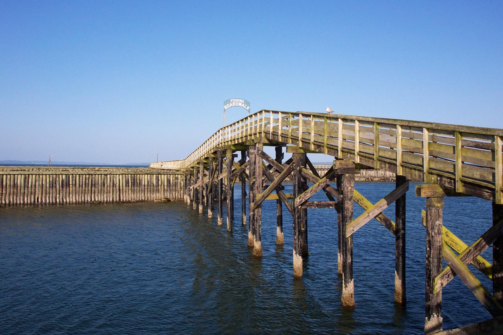
Boardwalk at Westport, WA
Bell on wharf in San
Francisco
Coastline in Huatulco, Oaxaca, Mexico
(gallery caption) 3 column, full width, cropped, linked to attachment pages
Boat BW PB Barco Texture Beautiful Fishing
Some more text for taking up space.
A two column gallery, aligned to the left, linked to media file.
In the editor, the image captions can be edited directly by clicking on the text.
If the number of images cannot be divided into the number of columns you have selected, the default is to have the last image(s) automatically stretch to the width of your gallery.
A four column gallery with a wide width:
Sunrise over the coast in Huatulco, Oaxaca, Mexico
Lorem ipsum dolor sit amet, consectetuer adipiscing elit. Donec mollis. Quisque convallis libero in sapien pharetra tincidunt. Aliquam elit ante, malesuada id,
tempor eu, gravida id, odio. Maecenas suscipit, risus et eleifend imperdiet, nisi orci ullamcorper massa, et adipiscing orci velit quis magna.
A five column gallery with normal images:
This is the same gallery, but with cropped images.
Six columns: does it work at all window sizes?
Boardwalk at Westport, WA
Golden Gate Bridge
Sydney Harbor Bridge
Bell on wharf in San Francisco
Rusty rails with fishplate, Kojonup
Boats and reflections, Royal Perth Yacht Club
Antique farm machinery, Mount Barker Museum, Western Australia
Raindrop ripples on a pond
Albany wind-farm against the sunset, Western Australia
Lorem ipsum dolor sit amet, consectetuer adipiscing elit. Donec mollis. Quisque convallis libero in sapien pharetra tincidunt. Aliquam elit ante, malesuada id, tempor eu, gravida id, odio. Maecenas suscipit, risus et eleifend imperdiet, nisi orci ullamcorper massa, et adipiscing orci velit quis magna.
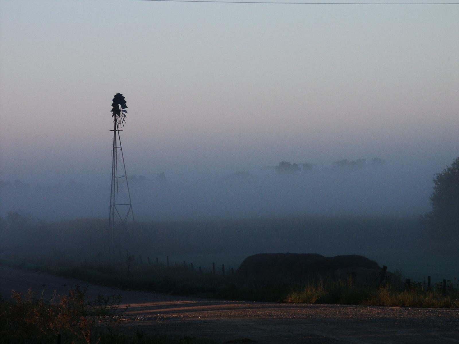
Windmill shrouded in fog at a farm outside of Walker, Iowa
Jericoacoara Ceara Brasil
Sunrise over the coast in Huatulco, Oaxaca, Mexico
Seven columns: how does this look on a narrow window?
It’s dangerous to go alone! Take this.
Boat BW PB Barco Texture Beautiful Fishing
Coastline in Huatulco, Oaxaca, Mexico
Jericoacoara Ceara Brasil
Sunrise over the coast in Huatulco, Oaxaca, Mexico
Beach at Big Sur, CA
Windmill shrouded in fog at a farm outside of Walker, Iowa
Sea and rocks, Plimmerton, New Zealand
Rusty rails with fishplate, Kojonup
images linked to media file – do captions obscure links?
Eight columns:
Lorem ipsum dolor sit amet, consectetuer adipiscing elit. Donec mollis. Quisque convallis libero in sapien pharetra tincidunt. Aliquam elit ante, malesuada id, tempor eu, gravida id, odio. Maecenas suscipit, risus et eleifend imperdiet, nisi orci ullamcorper massa, et adipiscing orci velit quis magna.
Boardwalk at Westport, WA
Golden Gate Bridge
Antique farm machinery, Mount Barker Museum, Western Australia
Orange Iris
Albany wind-farm against the sunset, Western Australia